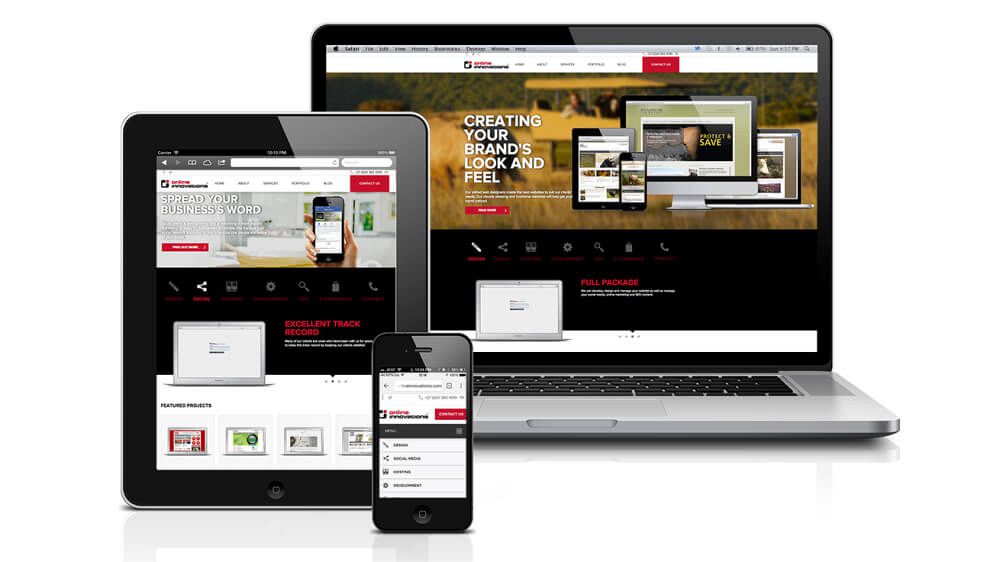
Today, they use a myriad of devices, including smartphones, tablets, laptops, and even smart TVs. With this diversity in devices, the need for responsive web design becomes evident.
Responsive web design prioritizes the user experience. It ensures that visitors to a website can easily navigate, interact with content, and enjoy a seamless experience, regardless of the device they're using. A positive user experience leads to higher engagement, lower bounce rates, and increased conversion rates.
To adapt to the multi-device world, many web designers and developers have adopted a mobile-first approach. This strategy involves designing a website with mobile devices in mind from the outset. This approach encourages simplicity, efficiency, and a focus on essential content, ensuring that the website performs optimally on smaller screens.
Responsive web design is more than just making a website fit different screen sizes. It involves adhering to a set of principles to create a cohesive and adaptable web experience.
One of the foundational principles of responsive web design is the use of fluid grids. Instead of fixed pixel-based layouts, designers use relative units like percentages to define grid structures. This allows content to flexibly adapt to various screen sizes.
Images and media must also be flexible. Designers use CSS to ensure that images resize proportionally to the screen, preventing awkward cropping or scaling issues.
Media queries are CSS rules that apply styles based on device characteristics such as screen width, height, and orientation. They enable designers to create different layouts for different devices, ensuring a tailored experience.
Creating a responsive website involves more than just following principles; it requires implementing best practices.
Website performance is crucial for user satisfaction. Optimizing images, minimizing HTTP requests, and using efficient code are essential steps to ensure speedy loading times on all devices.
For mobile devices, touch-friendly design is a must. Ensuring that buttons and interactive elements are appropriately sized and spaced for touch gestures enhances usability.
Progressive enhancement is an approach where the core content and functionality of a website are accessible to all users, regardless of their device or browser. Additional enhancements are then added for more capable devices, ensuring a robust user experience.
As technology continues to advance, the future of responsive web design is promising.
With the rise of wearables and the Internet of Things (IoT), responsive web design will extend beyond traditional screens. Designers will need to consider how to adapt content and interactions for devices like smartwatches, augmented reality glasses, and more.
Artificial intelligence (AI) will play a significant role in responsive web design, enabling websites to adapt not only to device characteristics but also to user preferences and behaviors. Personalized experiences will become more common.
Voice user interfaces, such as voice assistants, are becoming increasingly popular. Responsive web design will need to accommodate voice-driven interactions, providing audio-based content and navigation options.
Responsive web design is not a passing trend but a fundamental approach to web development. In a multi-device world, where users interact with websites on a variety of screens, responsive design ensures that the user experience remains consistent and enjoyable. By embracing essential principles and incorporating industry best practices, web designers have the power to craft websites that effortlessly evolve with the dynamic digital terrain. Globosoft, One of the top web designing companies in Kochi , Cochin and Ernakulam. As we look to the future, responsive design will continue to evolve to meet the demands of emerging technologies, making the web even more accessible and user-friendly for all. In a world where change is the only constant, responsive web design remains a steadfast pillar of user-centric web development. Embrace it, master it, and future-proof your digital presence.

Web design should be three things: human-centered, compelling and future-proof.
Enquire NowGrowth of your business has a lot to deal with tactical and effective SEO.
Enquire NowGive us a hint on what your business stand for and we will develop for you astate-of-the-art..
Enquire NowIn the digital era, Enterprise cloud governance essentiallydeals with applying specific policies ..
Enquire Now
